
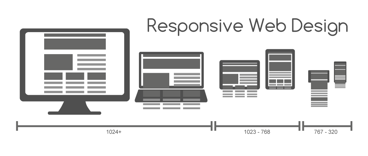
If your website is hard to read, tap, or navigate on a phone, you’re losing visitors before they ever see what you offer — and Google notices too. Most web traffic now comes from phones, and Google ranks sites based on how well the mobile version performs, not the desktop one.
Table of Contents
The good news: you don’t need to hire anyone or buy software to find out where you stand. This guide explains why mobile-friendliness matters and walks through the free tools professionals actually use to test it, step by step.
Quick Answer
Test your site’s mobile-friendliness for free with Google’s PageSpeed Insights (pagespeed.web.dev) for a scored report, Chrome DevTools’ device toolbar for a visual check, and the Core Web Vitals report in Google Search Console for ongoing monitoring of real visitor data. Together they show you exactly what to fix — and it takes about five minutes.
Why Mobile-Friendliness Isn’t Optional Anymore
Google uses mobile-first indexing, which means it crawls and ranks your site based on the mobile version of your pages, not the desktop version. This applies to every indexed website, not just some. If your mobile pages are missing content, images, or links that exist on desktop, that’s what Google evaluates — and your desktop rankings can suffer as a result, even if your desktop site looks great.
Beyond rankings, it’s a straightforward user experience issue. A visitor who has to pinch, zoom, or fight with a tiny ‘Contact Us’ button is more likely to leave and go to a competitor’s site instead. Mobile Core Web Vitals — how fast your site loads and how stable it feels while loading — are also a direct part of how Google evaluates page experience, so a slow or janky mobile site is a double penalty: fewer conversions and weaker search visibility.
How to Test Your Site for Free, Step by Step
Note first: Google retired its old standalone Mobile-Friendly Test tool at the end of 2023, and in November 2024 it also removed the dedicated Page Experience report from Search Console. That functionality now lives in the tools below, plus the Core Web Vitals report that remains in Search Console.
1. Run PageSpeed Insights. Go to pagespeed.web.dev, paste in your URL, and click Analyze. Make sure you’re looking at the ‘Mobile’ tab (it defaults to mobile results). You’ll get a 0–100 performance score plus specific, plain-language suggestions — like ‘images not sized correctly’ or ‘text too small to read’ — ranked by how much impact fixing them will have.
2. Eyeball it in Chrome DevTools. Open your site in Chrome, right-click anywhere on the page, choose Inspect, then click the device toolbar icon (or press Ctrl+Shift+M on Windows/Linux, Cmd+Shift+M on Mac). This switches the page into a phone-sized preview so you can see, tap, and scroll through your actual site as a mobile visitor would — no guessing required. Try a few device presets (iPhone, Galaxy, iPad) from the dropdown at the top to catch layout issues that only show up on certain screen sizes.
3. Check the Core Web Vitals report in Google Search Console. If you have Search Console set up for your domain, this report (found under the Experience section) shows how your indexed pages perform using data from real visitors over time, rather than a one-time test. This is the best free way to catch problems that develop after launch — a plugin update or new banner ad, for example, that quietly slows things down.
4. Do a real thumb test. Tools catch technical issues, but they won’t tell you a form field is annoyingly small or a menu is hard to tap with one hand. Spend two minutes actually browsing your site on your own phone: fill out your contact form, tap your primary buttons, and try reading your paragraphs without zooming.

Tips and Common Mistakes
Don’t chase a perfect 100 score. PageSpeed Insights scores are a diagnostic, not a grade — a fast-loading, easy-to-use site in the 80s-90s is usually more valuable to actual visitors than one obsessively tuned for a top score at the expense of other work.
Watch for content parity. A common mistake is hiding chunks of text, internal links, or entire sections on the mobile layout to ‘simplify’ the design. Since Google evaluates the mobile version as the canonical one, content that only appears on desktop may not get counted for SEO at all.
Check tap target spacing. Buttons and links placed too close together are one of the most frequent mobile usability complaints — and one of the easiest fixes, usually just a CSS padding adjustment.
Re-test after redesigns. Any theme change, plugin install, or new embedded widget (chat boxes, video embeds, ad scripts) can silently break mobile performance. Make a PageSpeed Insights check part of your routine after any site update, not just a one-time launch task.
Explore more: More web development guides.
Mobile-friendly website testing FAQs
Is Google’s Mobile-Friendly Test tool still available?
No. Google retired the standalone Mobile-Friendly Test tool and the related Mobile Usability report in Search Console at the end of 2023, and in November 2024 it also removed the separate Page Experience report from Search Console. It now recommends PageSpeed Insights and Chrome DevTools for testing, plus the Core Web Vitals report (still in Search Console under Experience) for ongoing monitoring.
Does mobile-friendliness really affect my search rankings?
Yes. Google uses mobile-first indexing for all websites, meaning it evaluates and ranks your site based on the mobile version of your pages. A poor mobile experience can hurt your visibility even in desktop search results.
What’s the fastest free way to check if my site is mobile-friendly?
Go to pagespeed.web.dev, enter your URL, and check the Mobile tab. It takes under a minute and gives you a score plus a prioritized list of fixes.
Do I need a developer to fix mobile issues?
Some fixes (like image sizing or button spacing) are simple theme or CSS tweaks that many site owners can handle, especially on platforms like WordPress or Squarespace. More technical issues — like render-blocking scripts or server response times — are usually worth handing to a developer.
Build It With GTStudios
Need help with your website, app, or small-business tech? GTStudios builds web, apps, and software for small businesses. See how GTStudios can help.
Photo: Muhammad Rafizeldi (MRafizeldi) / CC BY-SA 3.0, via Wikimedia Commons.